K Series ©
breaking through.
我們為 K Series 影展創作揭開序幕的識別設計、預告動畫,並強調三振, KO, Kick Out 精神,打破疫情突破黑暗。
We designed the visual identity and opening animation for K Series film festival to emphasize the spirit of the film festival: Strikeout, KO, Kick Out, breaking through the pandemic and the darkness.


Concept.
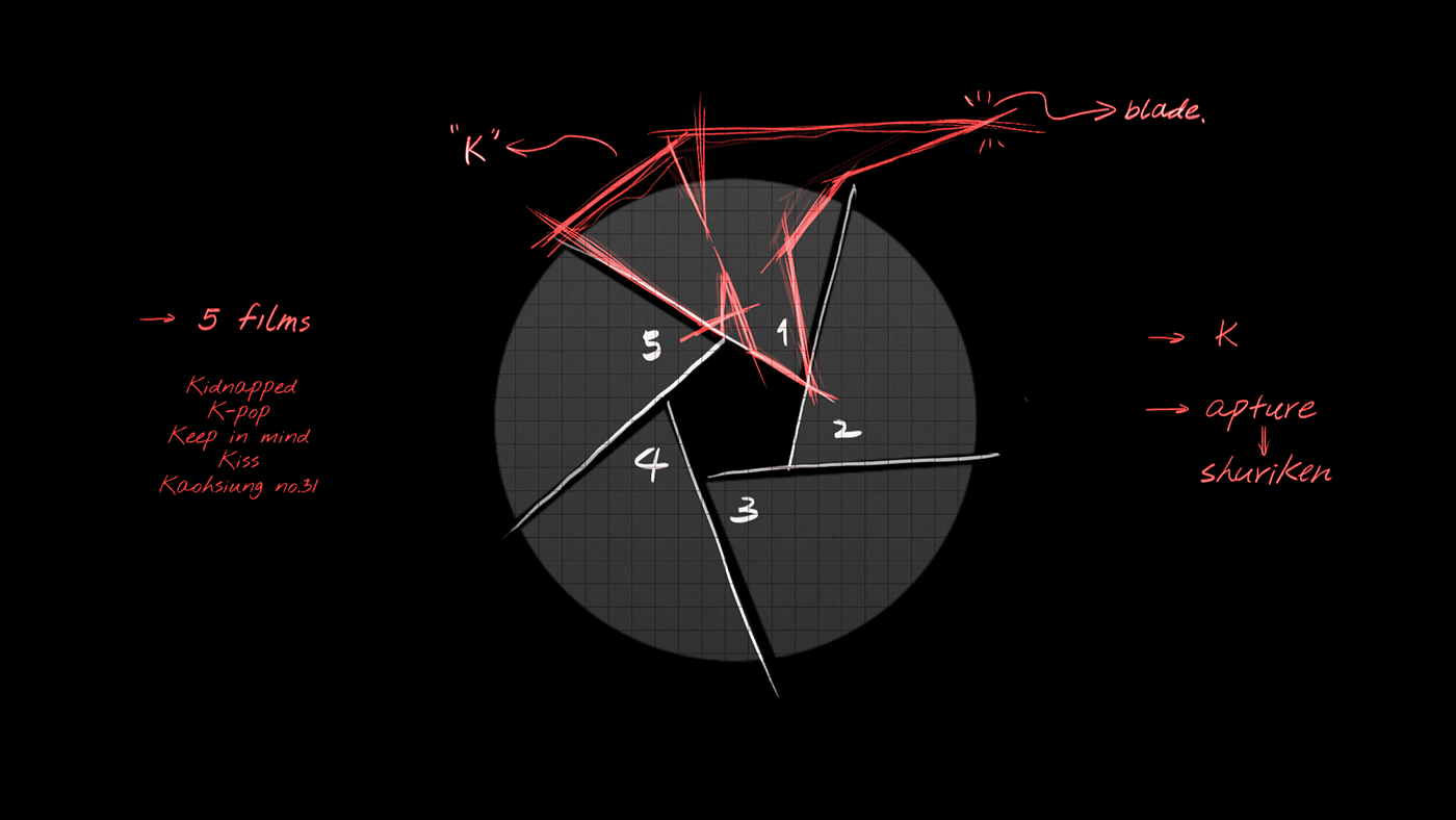
K Series 影展中共有五部影像作品,以此為概念延伸出手裡劍的意象,讓五部作品各佔一角、彼此相聚、環繞成為相機的光圈符號,象徵著不斷聚焦而銳利的刀刃。象徵這些作品中的議題不斷被聚焦並化為銳利的刀刃,劃破了這一切。
There are a total of five films in the K Series Film Festival. The character K stands for Kaohsiung, which means that each of them is based on a profound story in Kaohsiung. We use the spirit of the film festival as the concept to extend the image of shuriken, and the five films each take a corner, gather together, and surround each other as the symbol of the aperture, which symbolizes that we are constantly focused on these issues of the films. Finally the symbol of aperture turns into a sharp blade and breaking them all down.


Design.
在動態設計中,Logo Symbol 先以相機光圈的形式出現,而後旋轉變化成手裡劍,最終劃破畫面,嶄露光芒。
In the Motion design, the logo symbol first appeared in the form of the aperture, then rotated into a shuriken, and finally cut through the screen and revealed its light.


Graphics.
用以行銷以及推廣影展所使用之中英文海報,多個款式以符合不同用途與媒介。
The posters are used for marketing and promotion of the film festival in both English and Chinese, and are available in a variety of styles to suit different uses and media.


K Series
VI & Motion Design.
Present - Kaohsiung Film Fund
EP - Kaohsiung Film ArchiveR
Co EP - Graduate
Advisor - Kaohsiung City Government, Bureau of Cultural Affairs KHH
Product Studio - @studio.nonxo
Director - Heqian Chen
Design & Animation - XinYu Xu, Heqian Chen @studio.nonxo
sounddesign - 3H SOUND STUDIO LTD.
sounddesigner - PATRICK TU


